
Hiatus


Hiatus
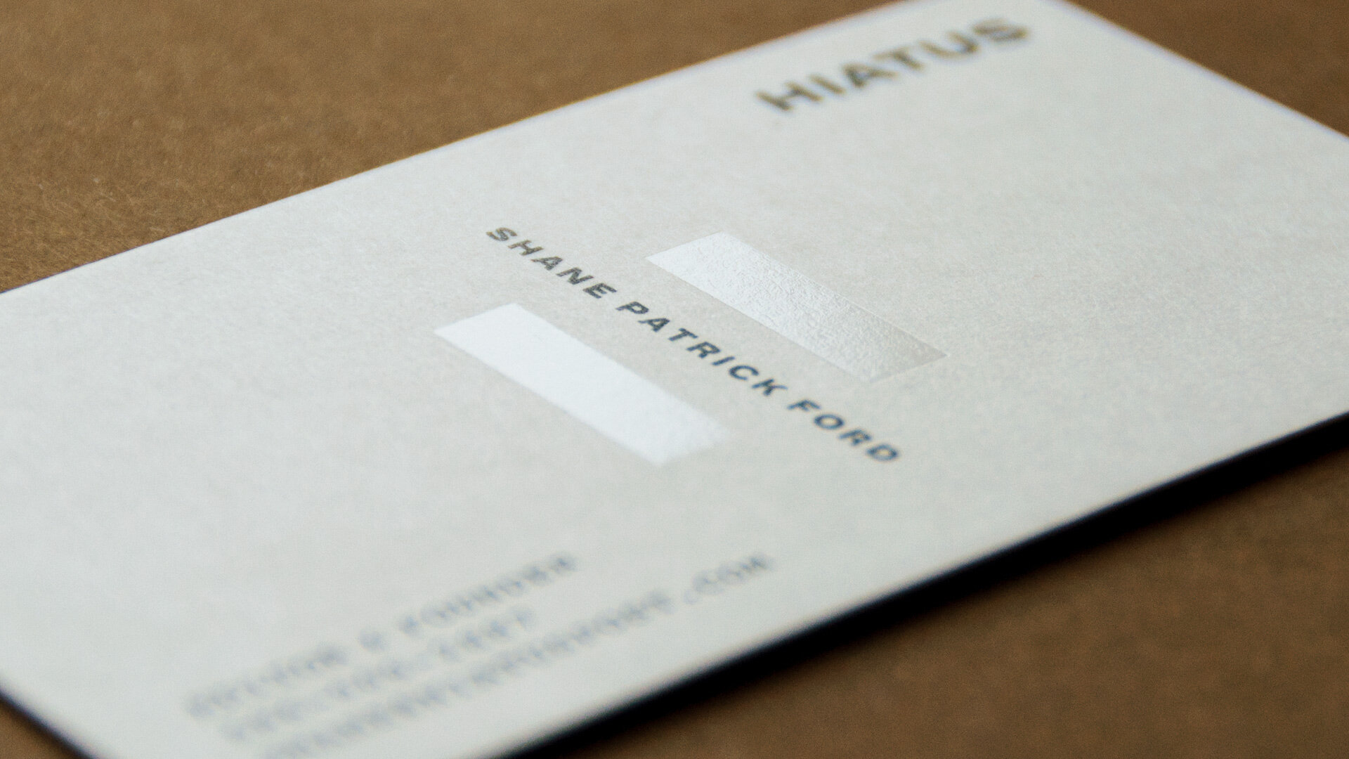
Brand identity for Detroit post-production studio, Hiatus. Inspired by their mantra — “A break from the typical, stepping back, taking a pause, reevaluating and updating the norm”, a simple, yet recognizable “H” that evokes a literal “pause” was created. The mark further communicates the idea of being suspended in time within the subtle uses on imagery and collateral.